When I flipped through the pages of today’s Straits Times’ Life section, I saw an ad of a young man laying on the grass with some Polaroids surrounding him. He looked happy in a posy, sheepish way. My first reaction of the the ad. Boring and amateur.
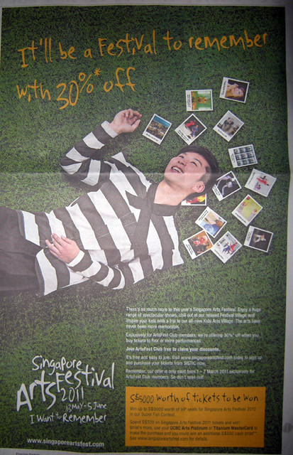
Then to my horror, I realised it was an ad for the upcoming Singapore Arts Festival 2011.
OMG! What is going on with this ad? After seeing last year’s disappointing campaign, themed “Between You And Me“, I was hoping this year’s campaign would be alot more vibrant and exciting. The 2011 theme “I Want To Remember“, doesn’t appeal or call out to me, nor does it even look like a campaign of a major arts festival in Singapore.
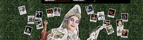
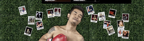
Where is the drive and festivity? The campaign continues at the Singapore Arts Festival website. You can see a green patch of grass as the background of the website. And at the bottom of the website, 3 different models (A young man, a boxer and an opera singer) take turns to sleep peacefully on the grass with the Polaroids surrounding them. It look more like a eco-friendly campaign, promoting green living than a arts festival campaign. Frankly, the theme might as well be called “Fall Asleep” or “I Love Green Grass“. Sigh.

As a former media creative, the campaign looks like it was made in-house on a low budget, regurgitated from last year’s campaign, or even created by students selected from an open-call. I am sure the Singapore Arts Festival organiser, the National Arts Council (NAC) could do a much better job than this. If the organiser is expecting the public to get excited by the festival, the campaign should represent the energy and creativity associated with the programmes.
Right now I am so bored by the ad that I do not event think I would want to check out any of the Singapore Arts Festival programme. However, if NAC is looking for some fresh idea, creative consultant or feedback for next year’s Art Festival campaign, I would be most happy to contribute.
NAC, it’s time to review your festival’s campaigns.