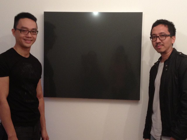
Jason Wee and Jeremy Sharma
Jeremy Sharma’s new work seems to be at once very adept at absorbing the viewer with it’s pure surfaces and reductive forms, and at the same time it creates a barrier to immediate understanding.
Whilst focusing my mind on the paintings, they insisted on quietly slipping out of grasp and comprehension. I was alarmed – were these artworks being coy? Shy? Or rudely ignoring my attempt to become acquainted? Naturally this sparked my desire to comprehend and disclose this series of works, so I donned my detective’s cap.
Elsewhere in my mind I wondered if that was the artist’s clever intention?
Sharma’s artistic practice is very different to the usual artwork I am surrounded by, so I took up the challenge to delve into it’s unfamiliar terrain, after seeing his new work at Grey Project’s gallery.
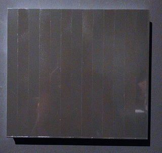
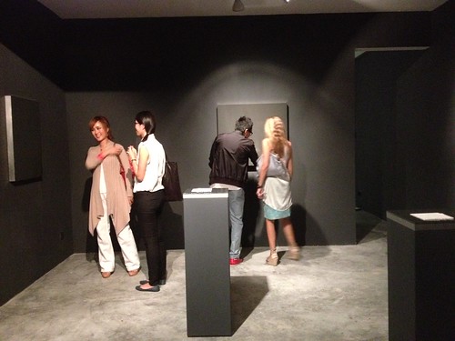
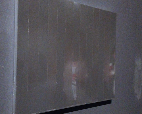
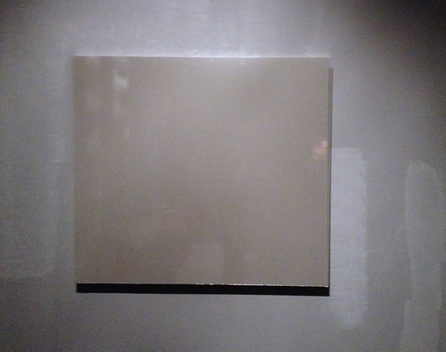
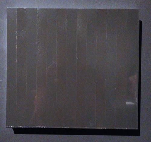
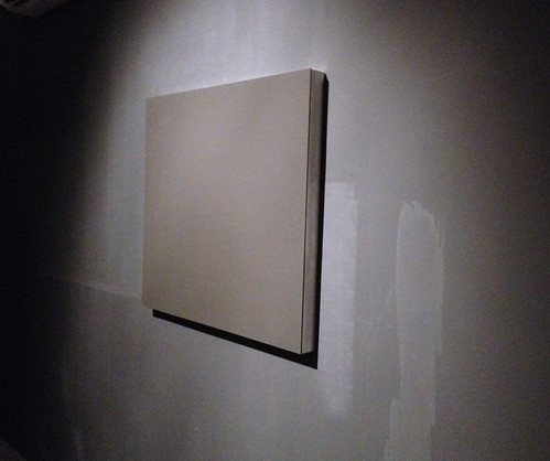
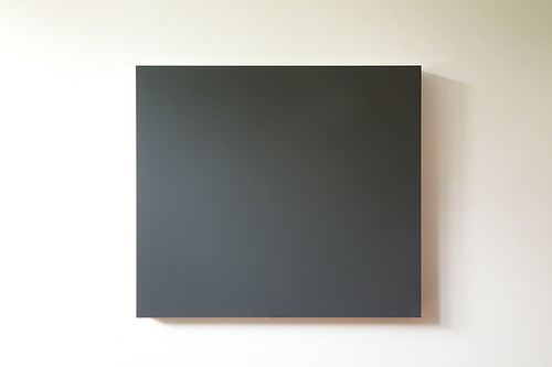
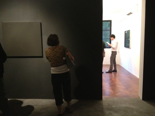
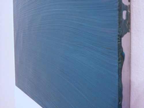
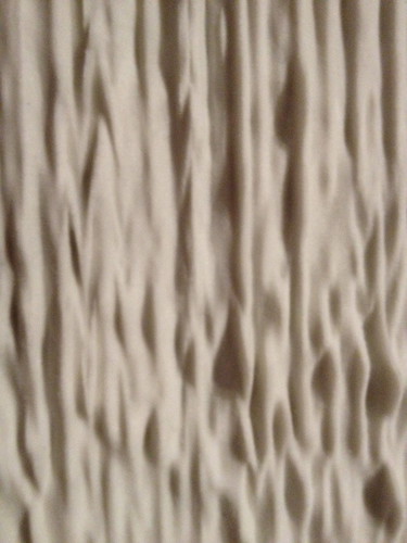
Grey Projects main space is, well, grey. The walls and floor are grey. The paintings designed to “play off the grey tones in our new gallery” are also grey with very smooth surfaces. They appear almost like industrial materials until closer inspection reveals that they are paintings with poured grey surfaces, concealing all but a few trace textures on their facade.
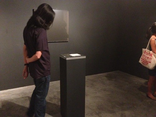
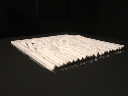
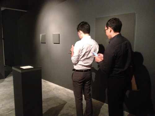
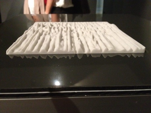
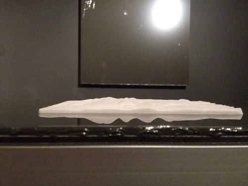
In the centre of the floor, two plinths display similar grey surfaces, with an inset of white, undulating material. This could be bone, plastic, or ceramic, but in fact is an example of 3D printing. It renders what seems to be a miniscule landscape of dramatically rolling hills, a square portion of choppy sea, or a ripple effect on some uninhabited surface. It’s colour is bleached and it’s true identity or significance unknown.
Armed with my experience of the show, and some hints in the gallery text, (which declares, “The astute observer will also discover surreptitious references to Andrei Tarkovsky’s films Solaris and Stalker, Michael Snow’s experimental film Wavelength, and post-punk band Joy Division’s seminal album Unknown Pleasures”), I embarked on a voyage to grasp Jeremy Sharma’s work and the concepts behind it.
And so, here I sit gazing into the grey, listening to ‘Joy division’, whose ‘Unknown Pleasures’ album cover features an iconic, raw monochrome visual of radio waves. Immediately I see this is clearly referenced in the rippled 3D printed pieces.
I am familiar with ‘Wavelength’, a 45-minute-long tracking shot showing a room, accompanied by a sound: a note slowly increasing in pitch. The camera gradually zooms in through a sped-up portion of time, during which we notice the passing of several days and nights through lighting changes. The camera diligently moves toward a photograph featuring the sea, and eventually the screen is filled with it’s waves.
The waves are an important motif in the film, and are also represented as the changing lightwaves and soundwaves which are interspersed with life as a few happenings occur in the room. The human moments never impinge on the ‘form’ of the film, which is intent on slowly zooming into that detail. We can certainly draw parallels here with Sharma. The paintings also feature smooth or undulating surfaces absorbing or reflecting the room’s lightwaves. One of the final paintings in the exhibition has more of a blue-grey tinge, and actually does offer up wave-like brush strokes. As viewers, we become a fleeting part of each grey surface as we stand in front of it and see ourselves reflected back. In ‘Wavelength’, these moments have been called “stray elements of reality”.
In this context, the paintings are creating a barren, dreamlike space, punctuated by occasional muted glimpses of the real. They reveal nothing, as if they have been erased or concealed. I see a metaphor for the human mind, a dream, a state of meditation, or perhaps a more myopic state.
From the amount I have been able to infer from what originally presented itself to me as a stubborn wall of paintings which the viewer fears may not ‘let us in’, it would seem that the artwork hinges on conceptual and metaphorical properties.
At first glance the paintings appear minimal to the point of being barely there, camouflaged within the walls. A definition of conceptual art is art in which the idea takes precedence over physical form, often resulting in artwork with a minimal physical constitution but possessing it’s complexity in the thought process and concept.
Minimalist art is traditionally the most difficult, embattled and controversial: Appearing to many as a case of ‘The Emperor’s new clothes’, and to others as striving to free art from the history and stereotype of image, beauty or subject. In a famous quote from Malevich, (the fierce father of Suprematism and a Minimalist ahead of the pack), he states that artwork should elevate emotion above cognitive processes, and declares his art “no longer cares to serve the state and religion… it wants to have nothing further to do with the object, and believes it can exist, in and for itself, without things.”
These quiet, secretive paintings could fit this theory. However I would argue that Sharma’s work is also painterly in a more traditional, processed-based manner. With the surface being the only physical subject matter – it’s shape and outline formed entirely through the process of the paint – it is a truly painterly piece. Talking to Jeremy at the exhibition opening, he explained how the method is quite painstaking – getting those surfaces flawless through a technique of pouring enamel paint on a gradual incline.
I would opine that these artworks speak of the flatness of surface, and the shift or transformation of both the paint and the viewer reflected in it. To me, the process and concept is about painting (albeit an atypical technique), but the completed artwork is not – because the process is not evident in the finished piece. There is a reductiveness which erases all reference to the making of the work, and therefore to the subject of the work.
These pieces oscillate between a minimalist, conceptual genre and a painterly tradition. The work might suggest a painting, but is in fact a sculptural metaphor for painting in a new manner. These ambivalent, mechanical pieces are asking us to look in a new way.
It is in fact not a painting at all. (Here they go, slipping out if grasp again).
In it’s minimalist form, I don’t believe that this new work is created through automatic or spontaneous creation. It is more precise, and has a similarity to the Hard Edge painters of the 1950s, who were uninterested in brushy gesturalism, and treated surfaces as a single flat expanse: Ellsworth Kelly with his oddly shaped monochrome paintings, and John McLaughlin’s precise geometric forms. This school of thought rests on a more traditionally Asian or Zen influence, showing the void between objects as being sometimes more important than the objects themselves. Another meditative metaphor.
Jason Wee, curator at Grey projects describes the work: “Painting as image, as surface; as material, object, construction and environment…inviting the viewer to consider painting’s limits and its experienced reality, in the interplay between structure, visibility and consciousness.”
In this show, Sharma creates works that barely resemble traditional art objects. Pieces which lean more towards industrial manufactured materials. His nod to modern technology through the 3D printed sculpture is a counterbalance to his discourse about painting in his earlier works which are more obviously created with visible brush strokes.
Having decided that these new artworks are in fact conceptual discussions of a new notion of painting, I contentedly decided to make tea and wrap up my inquiry into what these grey squares really are. I have befriended them, conversed with them, and found out their character.
Suddenly though, glancing at the catalogue images, I reversed back to a much more perceptual reading of the work: The tactile surfaces draw you close, the light refracts off, the textures reveal themselves as you traverse the gallery. By engaging our senses, does the artwork bypass cognition and allow a more immediate or intuitive recognition through the artwork’s aesthetic qualities?
I’ve been looking at these paintings all wrong, (yes I am calling them paintings again). The subtle surface changes; the squares within squares of grey; the multiple readings of the works as we view from in front, from a distance, and from an oblique angle. This is more about perception.
However, whilst Sharma’s past paintings have been more sensual in blues or yellows, the viewer is quite disconnected by this grey, industrialised series. There is something here to perceive but we are still straining to see into the vague grey mist. It feels unobtainable, like trying to peer behind the smoky glass of an exclusive hotel when clearly you do not possess the keycard. There is an in-between-ness. Not black or white, it is neither and both. The works speak of basic manufactured materials, and at the same time an aloof sense of luxury like cool flat marble. This is not a space for inhabiting.
Stripping the painting down to simply surface and monochrome allows a void in which the imagination can play. Does the grey reflect a state of emotion? A cloudy disposition? Or a neutral mode? The viewer decides whether grey is calm or tempestuous in this ambivalent space.
Sharma’s past works have been a metaphor for natural liquid forms such as waterfalls, lakes and rain – turning paint into a medium which flows, pours or blurs. Here we see similarities with artists like Ian Davenport and Helen Frankenthaler who attempt to imbue the artwork with the passage of time, through the physical journey of the paint. Davenport’s unusual painting method has been said to be an attempt to “take to the limit the near futility of the painting process”, (Michael Stanley). Davenport masters his iconic technique (using a syringe to apply paint), and simultaneously creates an arena where chance and mishaps so clearly affect the output.
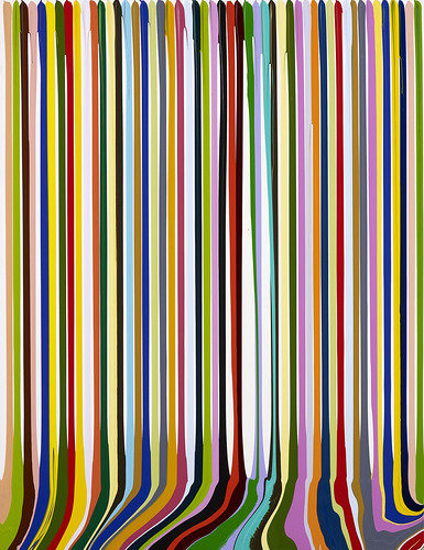
IAN DAVENPORT, Puddle Painting Prime II, Image courtesy of Art Plural
Although the performance of painting is evident in Davenport’s works, these new pieces by Sharma attempt not to show more than a hint of the human hand behind them. Although the traces are there, it is harder to imagine how they are made – an allegory perhaps for the objects and products we surround ourselves with daily, particularly digital technology which evades most people’s understanding.
Again a barrier is set up. (But again, I try to peep through.)
To add to the flummox, each piece is called ‘Untitled’, something which usually irks me unless it is a meaningful intention of the artist. (To me, the title is an important element of the artwork, in some cases as much as the subject matter itself). The ‘un-titles’ further develop the barrier and the impersonal uncanny of the paintings. The anonymity seems fitting somehow to the grey expanses which reveal nothing and reflect back the room. We decide the titles.
The name of the exhibition, ‘Exposition’ is at first glance similarly non-descriptive, (meaning the act of showing or exhibiting). However it can also refer to a photographic exposure (i.e light coming into contact with the medium, creating the moment when it transforms from blankness into an image). Exposition also indicates the act of explaining, exposing and revealing a meaning.
I fear that we are suspended in the moment before or during exposure here, but we do witness Sharma picking up the artists’ ongoing battle to posit new meanings. Painting itself is stubborn, it has the burden of it’s own history, it’s preconceptions and form. This is impossible to escape, yet Sharma pushes our understanding of what a painting should be. However – illustrative of the impossibility of this task – his work has to lose the label of ‘painting’ in order to achieve this. (And we’re back to calling them ‘artworks’).
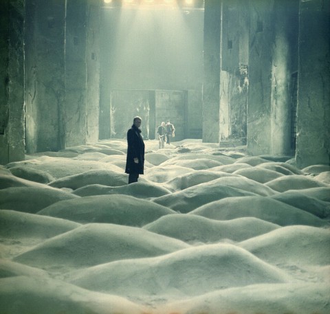
Still from Andrei Tarkovsky’s Solaris
Tarkovsky’s ‘Stalker’, is a story about profound revelation and self discovery. More chromatic shifts help determine physical reality and the subconscious. The human mind is seen to be creating barriers by imposing the laws of the exterior world, which are irrelevant inside an imaginary world.
So, the unsettling theme of boundaries and impediments, haziness and lack of understanding continues. The shifts between internal and external in these films is picked up in the artwork, which oscillates between being a deep, concealed space and a blank, reflective surface, like a darkened or blocked window.
The ideas of edges and limits are shown in the repetitive delineations of squares and rectangles. A diagram of the exhibition would make quite a fascinating visual – the grey square floor surrounded by grey square walls, hung with grey paintings of grey rectangles and forms, whilst the room houses two grey oblong plinths holding grey squares.
Unlike in the work of our friend Malevich with his mission to “create new realities”, there are no white fields for the grey squares to hover in here. Malevich’s white represented infinity, outer space. Instead in Sharma’s work we journey forever inwards. Having said that, as we journey into the second room, we do emerge into a white-walled space with a window for natural light, giving a much lighter and less oppressive feel. The return to a more traditional ‘white cube’ gallery space feels like it could hold some significance, or it could be simply a return to ‘normality’ – featuring as well that small blue painting which is reminiscent of Sharma’s previous works.
There are strong links between the specific colour palette, the chromatic scale and the reverberations of sound and light. These elements highlight time and transformation: The artworks, although very simple in their elements, are reactive to the time of day, the angle of a sunbeam, the positioning of the viewer. They also speak of interior and exterior, real and unreal, reflection and distortion, as well as increasingly smaller spaces and boundaries.
But what could be seen as the a micro environment, also becomes a macro environment as we look closely at the sculptural tableau of waves: It might be a frozen moment of delicate birdsong, or a vast glacial landscape somewhere in another galaxy.
Whilst abstract in nature, the abstraction is clearly not the message of the art, nor are the elements that come together to form it – the surface, colour or process. It is instead, a space for us to begin to understand something. Or at least try to. What sharma has presented us with is a springboard. It’s up to us to imagine the next steps.
See the show at Grey Projects, 8 March – 5 April 2013, Wednesday – Sunday, 12 – 7pm
Written by Nicola Anthony
Photography, courtesy of Grey Projects and Jeremy Sharma, Ian Davenport image kindly supplied by Art Plural Gallery