Simon Wee is best known for his calligraphy, not characters but strokes. His art consists mainly of thick circuitous strokes rendered in a single breath; strokes that come from the heart; strokes that come from the wrist, as that’s where calligraphy starts: from the circulation of the artist’s wrist that must stay unblocked, remain fluid. There is fluidity in all of Wee’s work.
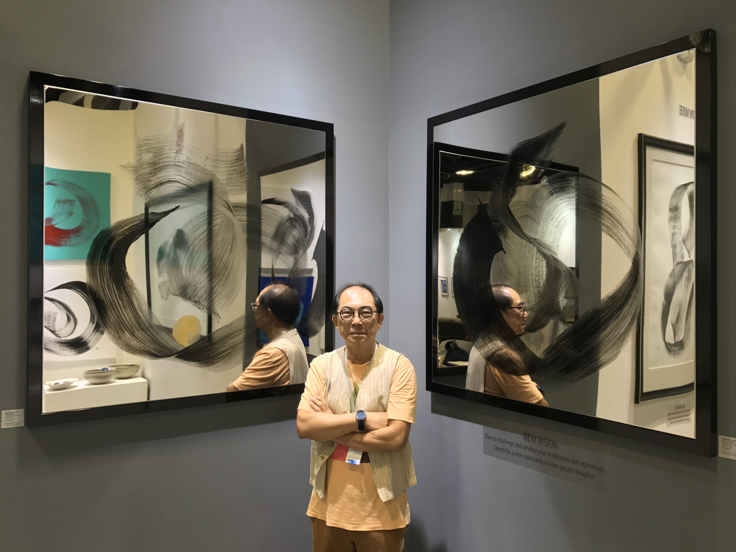
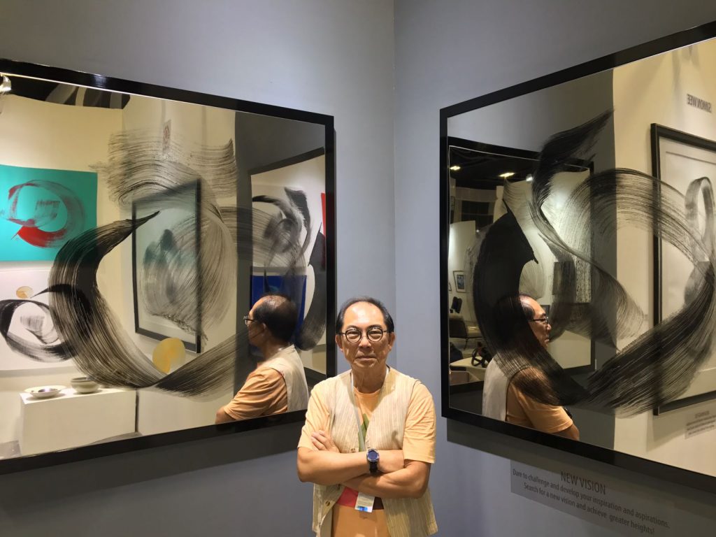
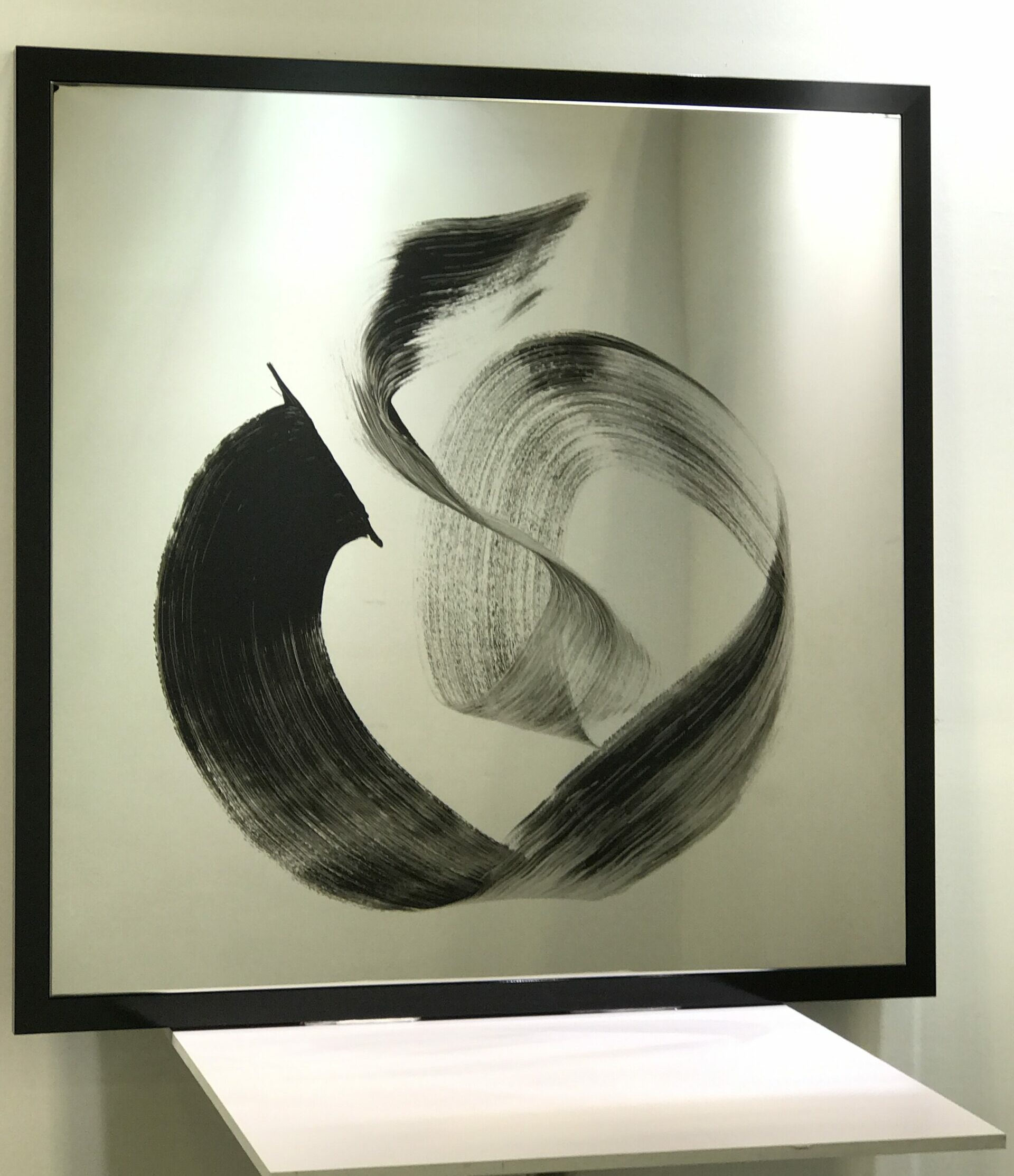
Each piece is unique; each piece describes his state of mind when he took the brush to paper. For Wee, each stroke is a carpe diem moment; each piece is a personal relationship between his mind and his hand, which he translates onto canvases, transcribed for the benefit of the conscious world. When a piece doesn’t capture the emotional energy he feels at the moment of painting, that piece is discarded; he’s the best judge of that because he stays true to his emotions. Wee’s pieces are signifiers of feelings, so they are abstract and minimalist in form yet layered with profound nuances. The strokes, although unique, may seem repetitious and monotonous to some viewers. However, for those who understand calligraphy, it is evident that the spirit of Zen is captured in each piece because Wee’s art is clean and pure: black acrylic on a white background or his recent black acrylic on mirrors coated with silver porcelain paint. These canvases are his new experiments, and they reflect Wee’s desire to work with stainless steel, a material that he is learning to grasp. His dream is to cast bronze or stainless steel sculptures. His positive spirit means that he will see this dream come true.
Simon paints in the mornings after his daily meditation sessions; the mind is fresh and open in the mornings, he explains. This could be the reason for the purity I sense in his work. He signs each piece with a Chinese character, ‘Chuan’ – the last character in his Chinese name: Wee Yik Chuan. This character means fountainhead or water source, symbolising a never-ending supply of water. In Chinese philosophy and the practice of geomancy, water is a symbol of life; water also represents abundance.
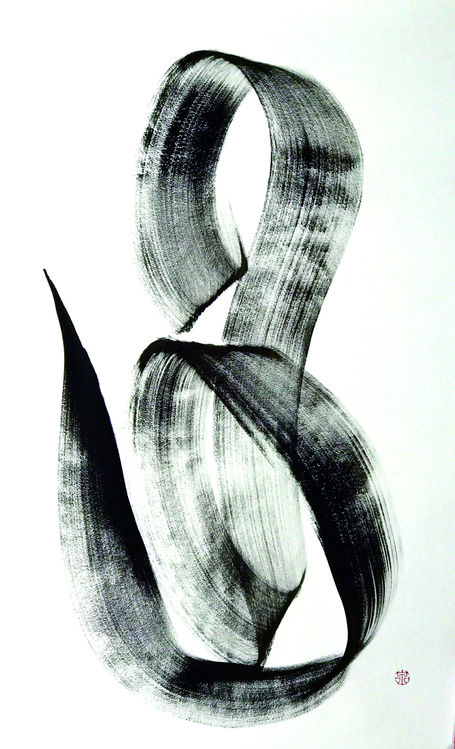
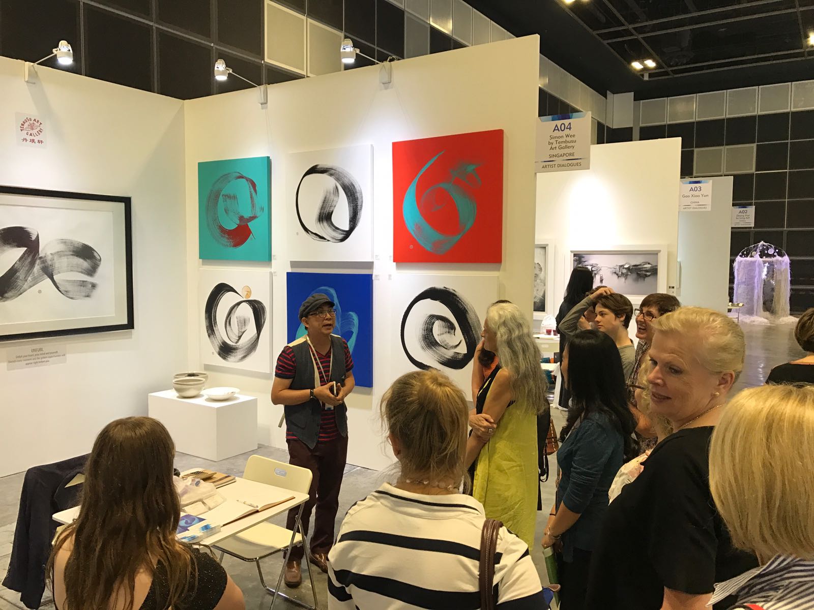
Simon was a moniker he had given himself at school because “I wanted to be remembered more easily.” He feels that a Western name would stick better to people’s memories. He wants “to be remembered for being human”. Love is what he wants to be remembered for when prompted to explain what “being human” means to him. For Wee, love defines him and his art: he loves life and loves his friends. This abundance of love emanates in our conversation. There is a sense of tranquillity about the man who pays no heed to the materialistic world around him. He creates single symbolic strokes to show his love for humanity, and he will continue to create even if there is no demand for his art. His paintings are entitled with a single word. For example, on sale at the Singapore Contemporary fair (Jan. 20-22, 2017) are ‘Meaningful’ and ‘Unfurl’, which resemble a long dragon trying to disentangle itself. The dragon is captured on a linen canvas, which is Wee’s attempt to maintain the aesthetics of calligraphy drawn on white rice paper (xuan paper). He explained that paper is not a good medium in Singapore’s humidity; it does not preserve well. His compromise is linen stretched tightly over a wooden frame, where his strokes can be realised and preserved.
I asked Wee how he comes up with the titles of his work. He pauses for some time before telling me that coming up with the word to describe each stroke is more difficult than painting the stroke itself; incidentally, the titles are in English. This is indicative of a man who feels with his heart, not his head. It is poignant because often, emotions are so difficult to describe: there are layers to the emotion ‘sad’ as there are multitudes of ‘happiness’. Wee’s strokes represent the nuances of emotions; “words are direct; they can confuse or upset people”, whereas a brushstroke holds a multilayered sense of emotion, cushioning the impact of the harshness that words sometimes convey. Wee uses his painting to write these emotions down, as one art critic mentioned.
I wonder if the problem is one mired in language and translation for Wee because he thinks in Chinese rather than English. The bilingual aspects of existence could often be lost in translation. For those who speak Chinese (including dialects), one knows that an emotion can be described with many synonyms in Mandarin, which may not capture the essence of that feeling when translated into English. Likewise, many words in English do not translate well into Mandarin. It is just as well that Wee speaks his mind in strokes. It is up to the beholder to interpret the nuances of each stroke.
Born in Singapore in 1946 to Hokkien-speaking parents hailing from South China, Wee started painting at a young age. He “simply loved to paint”, he says, and he still does. His first memories of art are of sketches he calls his “cartoon characters”, inspired by the comics he had read as a child. His aunt and uncle detected his talent. His uncle, a principal of Chinese High School, obliged the school’s art teacher, Chen Wen Hsi (first-generation Nanyang artist), to teach his 10-year-old nephew the basics of art. As a result, Simon Wee, the artist, emerged from Chen Wen Hsi’s kitchen, the venue of his art lessons. Chen taught Wee all the basics of art from “sketching to painting to pastels”; Wee progressed to oils and acrylics later.
In the mid-’60s, Wee enrolled at the Nanyang Academy of Fine Arts (NAFA), graduating in 1967. He dabbled in many media, from watercolours to oils to air-dry clay sculptures, before finally deciding to concentrate on calligraphy. For the past 20 years and more, he has only made art with his signature calligraphic strokes.
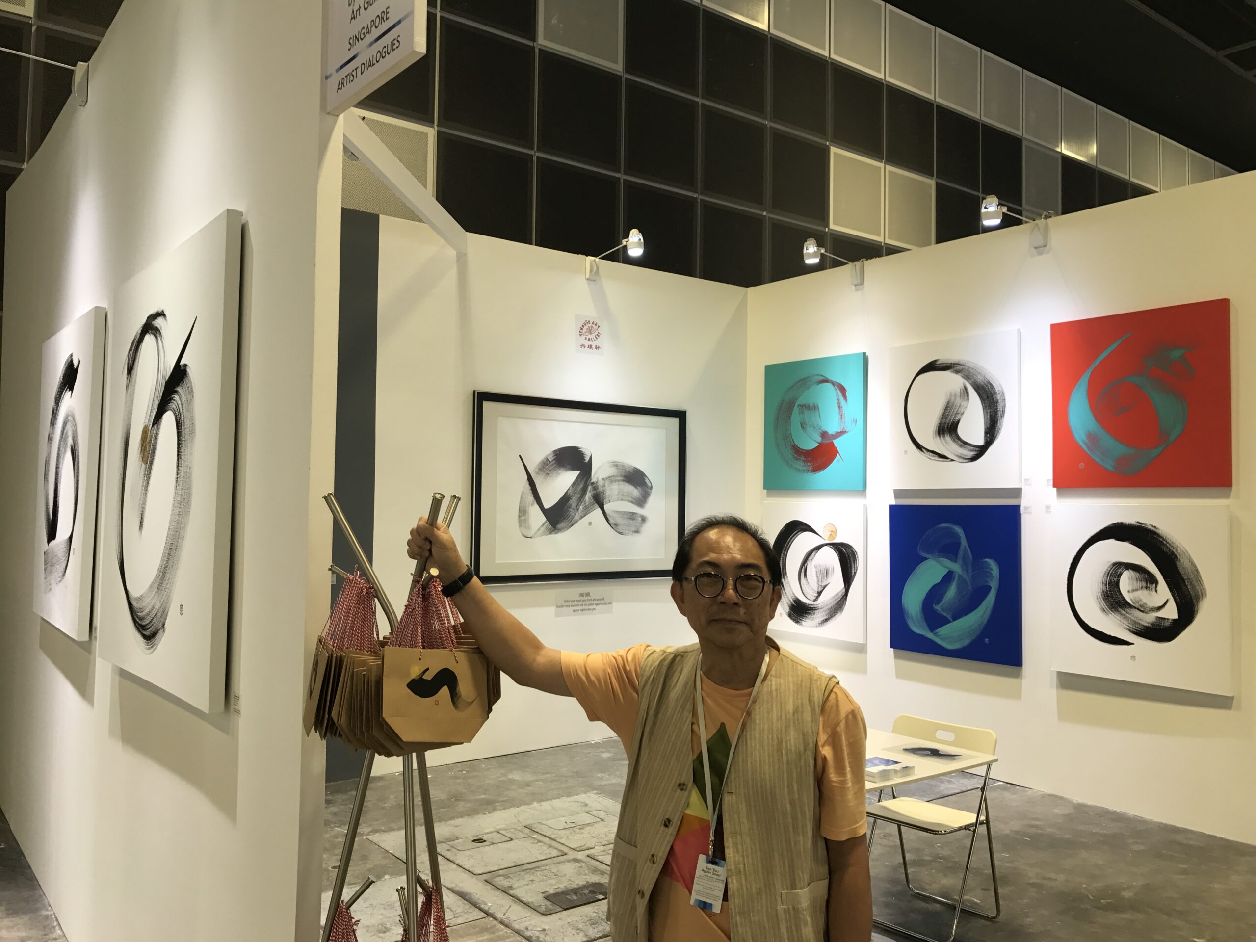
Wee is a true son of Singapore: he likes crossing Western styles with Eastern art. This intermingling of East and West is what makes Singapore a unique nation in Southeast Asia. For sale at the art fair are colourful canvases marked by an acrylic curvaceous calligraphic stroke and signed with his familiar ‘Chuan’ stamp. He tells me that the green, blue, and tomato-red backgrounds are “Peranakan colours”. Indeed, with a stretch of the imagination, they resemble the vibrant colours of the Nyonya ware favoured by the Peranakan Chinese in Singapore. These paintings have a pop-art quality; I’m reminded of Warhol’s many coloured canvases. However, the hallmark of Chinese-ness is Wee’s signature ‘Chuan’.
Evidently, Wee’s work is overflowing with abundance; his calligraphic strokes radiate an energetic exuberance at the Tembusu Gallery exhibition booth. His collectors are a few; British Airways is one of them. Simon remembers Monsieur Olivier Caron fondly, who was once France’s ambassador to Singapore. Wee’s pieces so touched Mr Caron that he bought a few before leaving the city-state.
Simon Wee bids me farewell as our conversation comes to an end. I watch the man, who is blessed with a humble spirit and a kind heart reflected in his infectious smile, greet an old friend who had stopped by earlier to continue discussing his new pieces – the silver porcelain-coated canvases.
Eva Wong Nava is a published writer, former blogger and emerging art historian. She combines her love for art with writing personal reviews and anecdotes. Her flash fiction can be found in Jellyfish Review and Flash Fiction Magazine. Her art writings have appeared in several independent art magazines.
All images courtesy of Tembusu Art Gallery.